FUNDACIÓN SOTO
LA FILOSOFÍA DEL ARTE
CONTEXT
This school project involved creating a visual identity for a foundation dedicated to the artist Jesús-Rafael Soto. Through this work, we aimed to evoke his iconic artworks while capturing the precision and rigor that define his artistic practice.
TYPE
Brand Design
YEAR
2022

LOGOTYPE
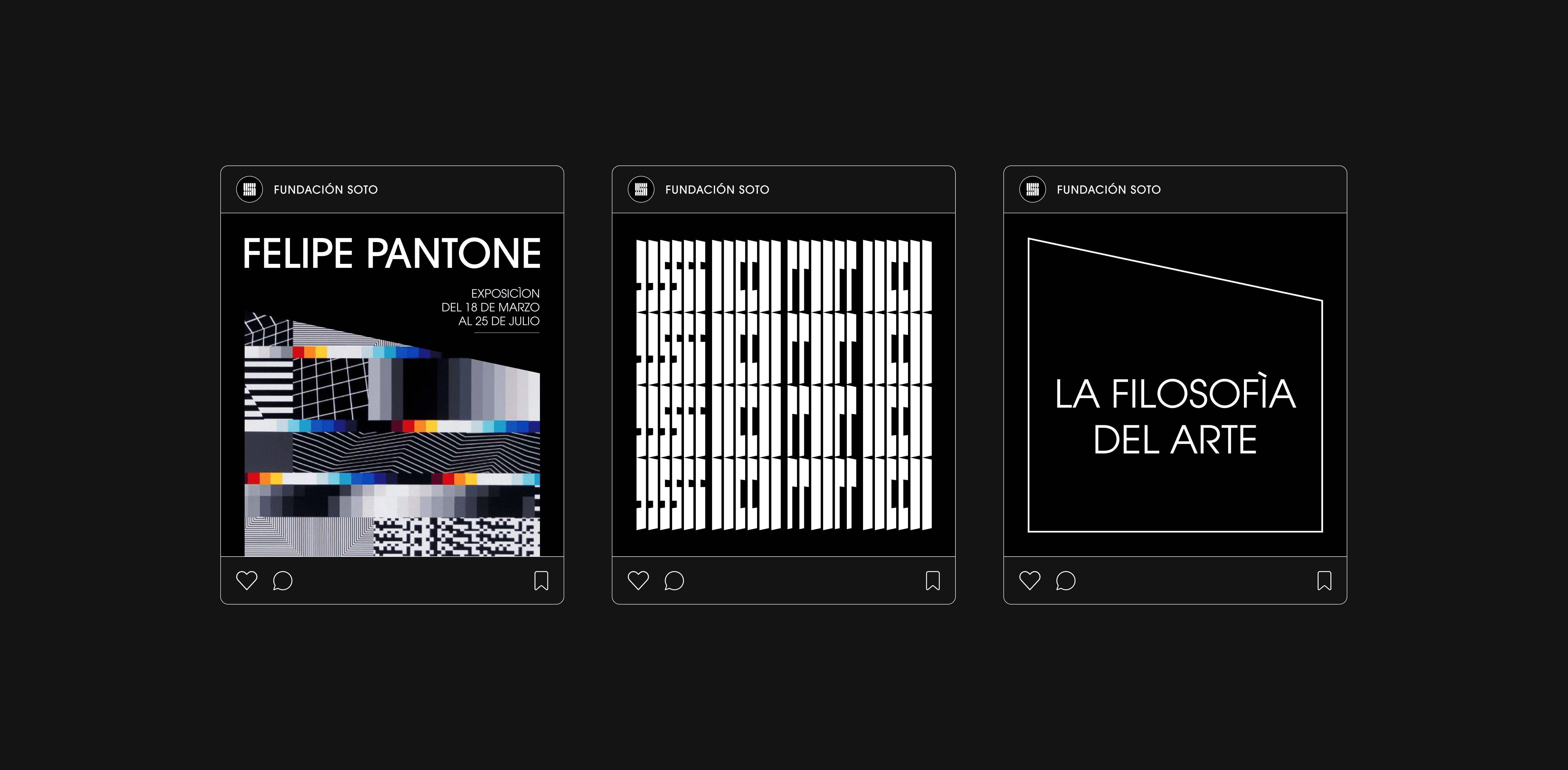
A logotype directly inspired from Soto's pénétrables: vertical slats built on a strict typographic grid, kept in black and white to preserve the foundation's sobriety. A subtle perspective at the tips of the slats evokes a shifting point of view, echoing the way the viewer's gaze penetrates the original works.


GRID SYSTEM
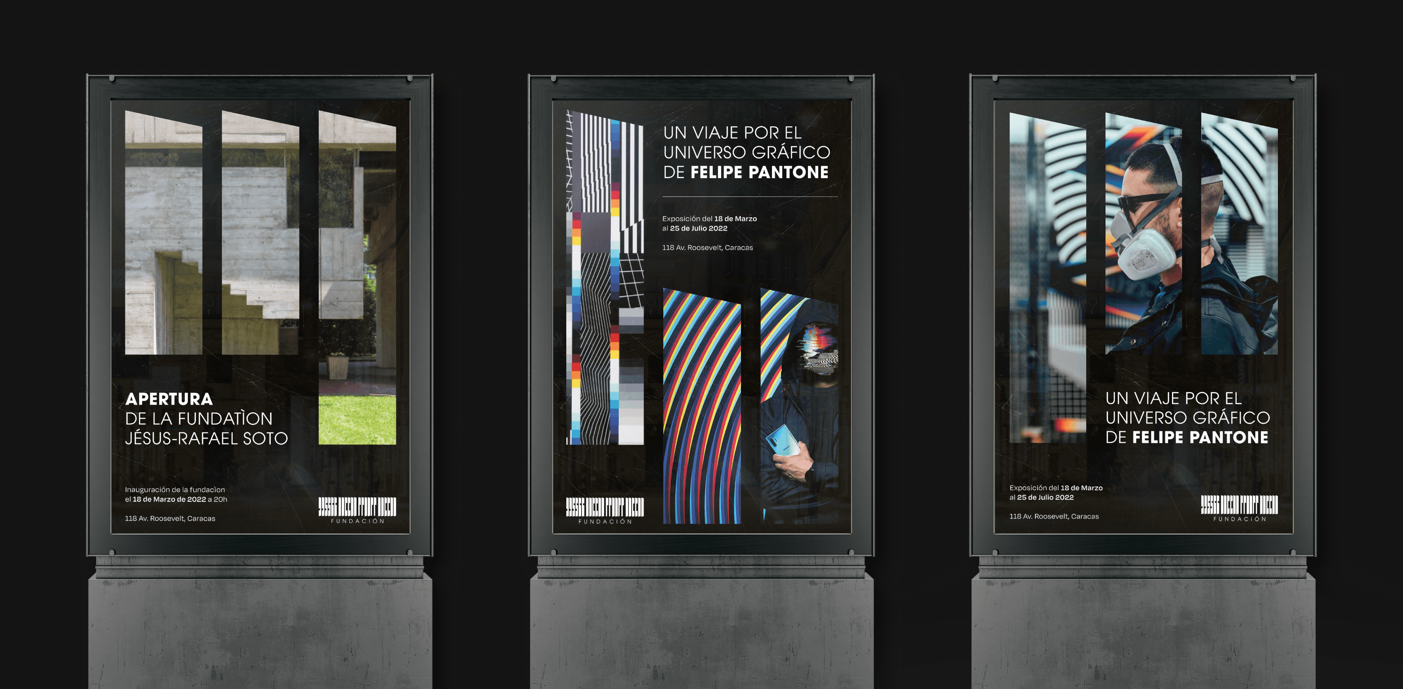
From the logo, we extracted its essential elements to build a modular grid based on its slats. This grid organises content across formats, from Decaux billboards to kakémonos, while freeing up space for images. On a black background, each composition lets the visuals radiate at its centre.
ON-SITE SIGNAGE
On-site, the same language extends into a full signage system: custom pictograms built with bevels that recall the tilt of the slats, paired with a dedicated, set of numbers. It is materialised in matte black aluminium.


FUNDACIÓN SOTO
LA FILOSOFÍA DEL ARTE
CONTEXT
This school project involved creating a visual identity for a foundation dedicated to the artist Jesús-Rafael Soto. Through this work, we aimed to evoke his iconic artworks while capturing the precision and rigor that define his artistic practice.
TYPE
Brand Design
YEAR
2022
LOGOTYPE
A logotype directly inspired from Soto's pénétrables: vertical slats built on a strict typographic grid, kept in black and white to preserve the foundation's sobriety. A subtle perspective at the tips of the slats evokes a shifting point of view, echoing the way the viewer's gaze penetrates the original works.
GRID SYSTEM
From the logo, we extracted its essential elements to build a modular grid based on its slats. This grid organises content across formats, from Decaux billboards to kakémonos, while freeing up space for images. On a black background, each composition lets the visuals radiate at its centre.
ON-SITE SIGNAGE
On-site, the same language extends into a full signage system: custom pictograms built with bevels that recall the tilt of the slats, paired with a dedicated, set of numbers. It is materialised in matte black aluminium.
FUNDACIÓN SOTO
LA FILOSOFÍA DEL ARTE
CONTEXT
This school project involved creating a visual identity for a foundation dedicated to the artist Jesús-Rafael Soto. Through this work, we aimed to evoke his iconic artworks while capturing the precision and rigor that define his artistic practice.
TYPE
Brand Design
YEAR
2022
LOGOTYPE
A logotype directly inspired from Soto's pénétrables: vertical slats built on a strict typographic grid, kept in black and white to preserve the foundation's sobriety. A subtle perspective at the tips of the slats evokes a shifting point of view, echoing the way the viewer's gaze penetrates the original works.
GRID SYSTEM
From the logo, we extracted its essential elements to build a modular grid based on its slats. This grid organises content across formats, from Decaux billboards to kakémonos, while freeing up space for images. On a black background, each composition lets the visuals radiate at its centre.
ON-SITE SIGNAGE
On-site, the same language extends into a full signage system: custom pictograms built with bevels that recall the tilt of the slats, paired with a dedicated, set of numbers. It is materialised in matte black aluminium.