BLABLABCAR
CARPOOLING MADE SIMPLE
CONTEXT
As part of a product design bootcamp with The Design Crew, I teamed up with two other designers to tackle a challenge set by BlaBlaCar: how might we improve the management of trips tied to large events? We had a two-week sprint to cover the full process: ideation, prototyping, testing, and refinement.
TYPE
Product Design
YEAR
2026


CARPOOLING TO EVENTS
BlaBlaCar lets passengers book a seat with a driver heading to a shared destination. We focused on people travelling to large events because these trips represent 18% of all bookings while accounting for 8.5% of the support tickets we reviewed. That concentration pointed to a recurring pain point: passengers struggling to find their driver in a crowded, unfamiliar place.


SUCCESS CRITERIA
We were given two acceptance criteria that should be observable if our solutions are effective. Fewer cancellations from people who can't find each other and fewer support tickets related to this type of trip.

CURRENT STATE ANALYSIS
There is currently no way to share your position between users, just an address and a small map icon that lacks affordance. The contact button is hidden behind the driver's profile, which can be hard to find for certain users. Also, car details are too sparse to locate a specific car in a huge parking lot for people who don't know car brands.
BENCHMARK
Before diving into our solutions, we looked at best-in-class players in position sharing and car-related apps, such as private drivers, autonomous taxis, and social or messaging apps. We found some great UI elements, such as car description cards including a picture and the plate number, better displays of position, and well-crafted UX flows for sharing a position between users.

SOLUTIONS
Before diving into our solutions, we looked at best-in-class players in position sharing and car-related apps, such as private drivers, autonomous taxis, and social or messaging apps. We found some great UI elements, such as car description cards including a picture and the plate number, better displays of position, and well-crafted UX flows for sharing a position between users.

REGROUP PARTICIPANTS
Our first idea encouraged passengers heading to the same event to regroup. As they searched for the nearby city, we suggested the event name as their destination. The results page would then highlight matching event-based trips.

TRIP DETAILS IMPROVEMENTS
We redesigned the trip details: an illustration of the vehicle, a colour indicator made clearer with a coloured circle, and the licence plate. We also added a "contact" CTA on this screen, so users stuck looking for information reach out to each other rather than to support.
LOCATION SHARING
To make meeting up easier, we added a CTA that invites passengers to request the driver's location when they open the conversation around departure time. The driver can then agree to share their exact position for a set duration.
VEHICLE LOCATION SHARING
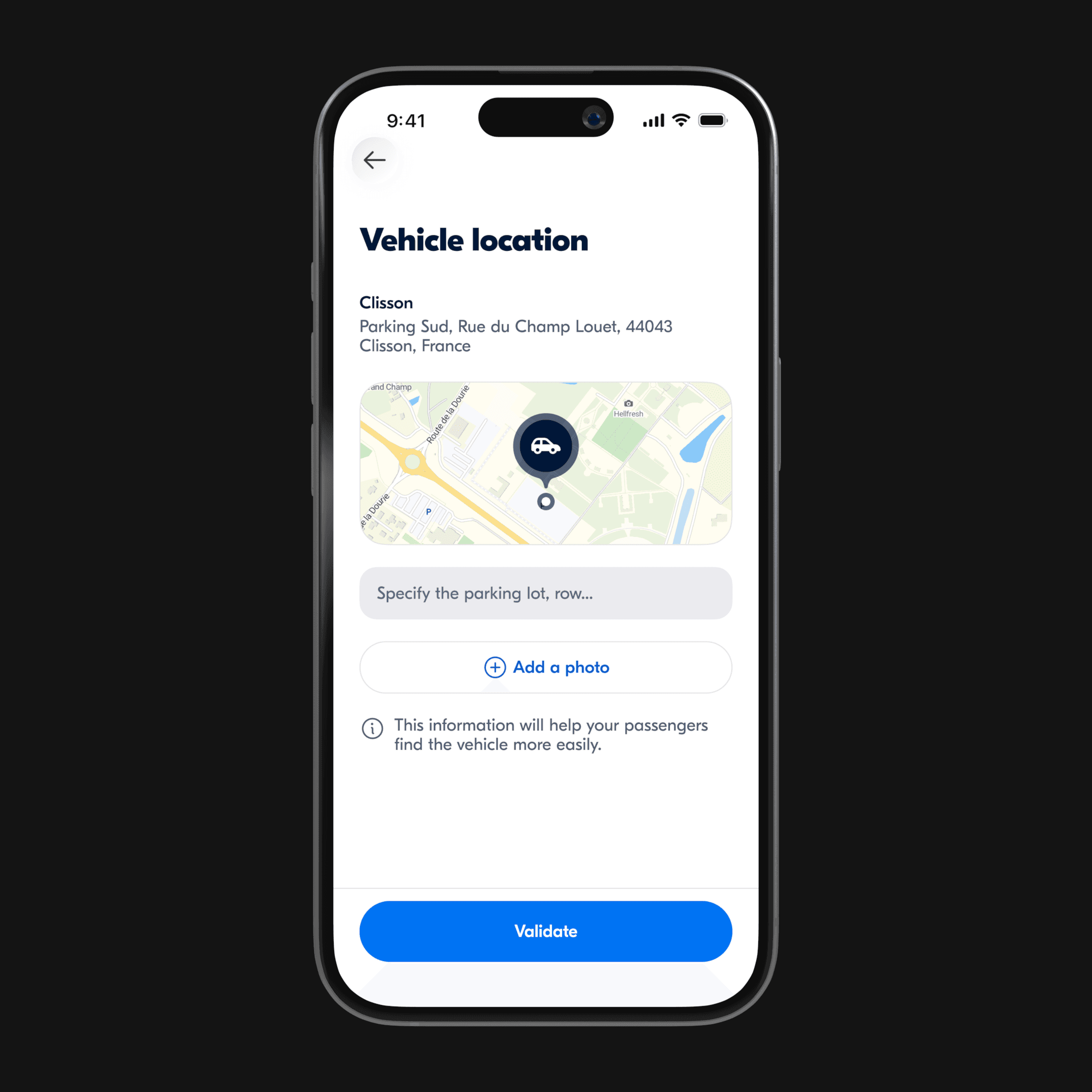
To complete our location-sharing feature, we let drivers share their vehicle's location before departure if they're already parked nearby. Passengers get notified and can preview the exact pickup point ahead of time, making it much easier to regroup on time in a large festival parking lot.
USER TESTS
We ran 45-minute usability tests with five users, covering both sides of the experience (passenger and driver). The solutions landed well overall, the main exception was the search nudge, which few users understood. We also spotted a few fixes to sharpen the vehicle-sharing flow.


REGROUP PARTICIPANTS
Since all users skipped the informational modal about the Bundles feature, I decided to adopt a less aggressive approach to announce the new feature by using a card in the "Me" tab, as users will necessarily see it when managing their listings.


POSITION SHARING
Requesting the driver's location was understood and used by every participant, so we kept it as is and simply added a button to open the position in the user's preferred map app, which several people had asked for.


VEHICLE POSITIONING
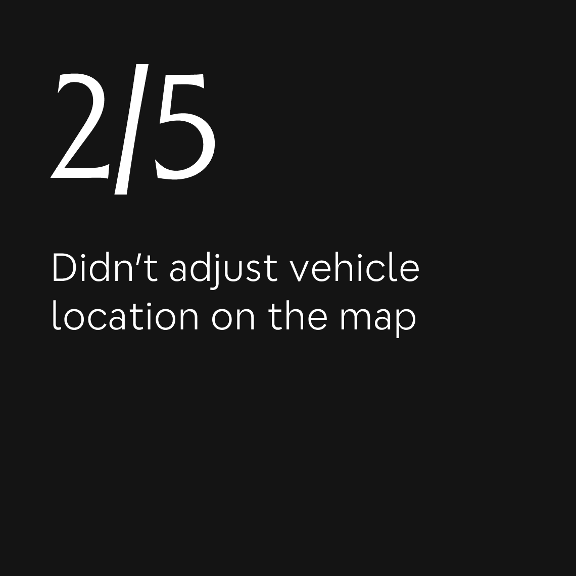
Since some users missed the step of adjusting the vehicle's location on the map, we added a tooltip above the cursor. We also refined the user-position indicator for legibility and reworked the wording to make it clear an action is required.


VEHICLE LOCATION DETAILS
After confirming the vehicle's location, some users skipped adding a note or a photo so we introduced a short prompt encouraging them to do it, helping passengers find the car more easily.

BLABLABCAR
CARPOOLING MADE SIMPLE
CONTEXT
As part of a product design bootcamp with The Design Crew, I teamed up with two other designers to tackle a challenge set by BlaBlaCar: how might we improve the management of trips tied to large events? We had a two-week sprint to cover the full process: ideation, prototyping, testing, and refinement.
TYPE
Product Design
YEAR
2026
CARPOOLING TO EVENTS
BlaBlaCar lets passengers book a seat with a driver heading to a shared destination. We focused on people travelling to large events because these trips represent 18% of all bookings while accounting for 8.5% of the support tickets we reviewed. That concentration pointed to a recurring pain point: passengers struggling to find their driver in a crowded, unfamiliar place.
SUCCESS CRITERIA
We were given two acceptance criteria that should be observable if our solutions are effective. Fewer cancellations from people who can't find each other and fewer support tickets related to this type of trip.
CURRENT STATE ANALYSIS
There is currently no way to share your position between users, just an address and a small map icon that lacks affordance. The contact button is hidden behind the driver's profile, which can be hard to find for certain users. Also, car details are too sparse to locate a specific car in a huge parking lot for people who don't know car brands.
BENCHMARK
Before diving into our solutions, we looked at best-in-class players in position sharing and car-related apps, such as private drivers, autonomous taxis, and social or messaging apps. We found some great UI elements, such as car description cards including a picture and the plate number, better displays of position, and well-crafted UX flows for sharing a position between users.
SOLUTIONS
Before diving into our solutions, we looked at best-in-class players in position sharing and car-related apps, such as private drivers, autonomous taxis, and social or messaging apps. We found some great UI elements, such as car description cards including a picture and the plate number, better displays of position, and well-crafted UX flows for sharing a position between users.
REGROUP PARTICIPANTS
Our first idea encouraged passengers heading to the same event to regroup. As they searched for the nearby city, we suggested the event name as their destination. The results page would then highlight matching event-based trips.
TRIP DETAILS IMPROVEMENTS
We redesigned the trip details: an illustration of the vehicle, a colour indicator made clearer with a coloured circle, and the licence plate. We also added a "contact" CTA on this screen, so users stuck looking for information reach out to each other rather than to support.
LOCATION SHARING
To make meeting up easier, we added a CTA that invites passengers to request the driver's location when they open the conversation around departure time. The driver can then agree to share their exact position for a set duration.
VEHICLE LOCATION SHARING
To complete our location-sharing feature, we let drivers share their vehicle's location before departure if they're already parked nearby. Passengers get notified and can preview the exact pickup point ahead of time, making it much easier to regroup on time in a large festival parking lot.
USER TESTS
We ran 45-minute usability tests with five users, covering both sides of the experience (passenger and driver). The solutions landed well overall, the main exception was the search nudge, which few users understood. We also spotted a few fixes to sharpen the vehicle-sharing flow.
REGROUP PARTICIPANTS
Since all users skipped the informational modal about the Bundles feature, I decided to adopt a less aggressive approach to announce the new feature by using a card in the "Me" tab, as users will necessarily see it when managing their listings.
POSITION SHARING
Requesting the driver's location was understood and used by every participant, so we kept it as is and simply added a button to open the position in the user's preferred map app, which several people had asked for.
VEHICLE POSITIONING
Since some users missed the step of adjusting the vehicle's location on the map, we added a tooltip above the cursor. We also refined the user-position indicator for legibility and reworked the wording to make it clear an action is required.
VEHICLE LOCATION DETAILS
After confirming the vehicle's location, some users skipped adding a note or a photo so we introduced a short prompt encouraging them to do it, helping passengers find the car more easily.
BLABLABCAR
CARPOOLING MADE SIMPLE
CONTEXT
As part of a product design bootcamp with The Design Crew, I teamed up with two other designers to tackle a challenge set by BlaBlaCar: how might we improve the management of trips tied to large events? We had a two-week sprint to cover the full process: ideation, prototyping, testing, and refinement.
TYPE
Product Design
YEAR
2026
CARPOOLING TO EVENTS
BlaBlaCar lets passengers book a seat with a driver heading to a shared destination. We focused on people travelling to large events because these trips represent 18% of all bookings while accounting for 8.5% of the support tickets we reviewed. That concentration pointed to a recurring pain point: passengers struggling to find their driver in a crowded, unfamiliar place.
SUCCESS CRITERIA
We were given two acceptance criteria that should be observable if our solutions are effective. Fewer cancellations from people who can't find each other and fewer support tickets related to this type of trip.
CURRENT STATE ANALYSIS
There is currently no way to share your position between users, just an address and a small map icon that lacks affordance. The contact button is hidden behind the driver's profile, which can be hard to find for certain users. Also, car details are too sparse to locate a specific car in a huge parking lot for people who don't know car brands.
BENCHMARK
Before diving into our solutions, we looked at best-in-class players in position sharing and car-related apps, such as private drivers, autonomous taxis, and social or messaging apps. We found some great UI elements, such as car description cards including a picture and the plate number, better displays of position, and well-crafted UX flows for sharing a position between users.
SOLUTIONS
Before diving into our solutions, we looked at best-in-class players in position sharing and car-related apps, such as private drivers, autonomous taxis, and social or messaging apps. We found some great UI elements, such as car description cards including a picture and the plate number, better displays of position, and well-crafted UX flows for sharing a position between users.
REGROUP PARTICIPANTS
Our first idea encouraged passengers heading to the same event to regroup. As they searched for the nearby city, we suggested the event name as their destination. The results page would then highlight matching event-based trips.
TRIP DETAILS IMPROVEMENTS
We redesigned the trip details: an illustration of the vehicle, a colour indicator made clearer with a coloured circle, and the licence plate. We also added a "contact" CTA on this screen, so users stuck looking for information reach out to each other rather than to support.
LOCATION SHARING
To make meeting up easier, we added a CTA that invites passengers to request the driver's location when they open the conversation around departure time. The driver can then agree to share their exact position for a set duration.
VEHICLE LOCATION SHARING
To complete our location-sharing feature, we let drivers share their vehicle's location before departure if they're already parked nearby. Passengers get notified and can preview the exact pickup point ahead of time, making it much easier to regroup on time in a large festival parking lot.
USER TESTS
We ran 45-minute usability tests with five users, covering both sides of the experience (passenger and driver). The solutions landed well overall, the main exception was the search nudge, which few users understood. We also spotted a few fixes to sharpen the vehicle-sharing flow.
REGROUP PARTICIPANTS
Since all users skipped the informational modal about the Bundles feature, I decided to adopt a less aggressive approach to announce the new feature by using a card in the "Me" tab, as users will necessarily see it when managing their listings.
POSITION SHARING
Requesting the driver's location was understood and used by every participant, so we kept it as is and simply added a button to open the position in the user's preferred map app, which several people had asked for.
VEHICLE POSITIONING
Since some users missed the step of adjusting the vehicle's location on the map, we added a tooltip above the cursor. We also refined the user-position indicator for legibility and reworked the wording to make it clear an action is required.
VEHICLE LOCATION DETAILS
After confirming the vehicle's location, some users skipped adding a note or a photo so we introduced a short prompt encouraging them to do it, helping passengers find the car more easily.